Florida State University's visual style is one of the most recognizable pieces of our identity. FSU’s Garnet and Gold prompt immediate recognition, and we endeavor to make all aspects of our university’s personality identifiable, from colors to graphics and fonts.
Primary Colors
FSU Garnet and FSU Gold should take the lead on the color ratio in any communication material and must make up at least 70% visual prominence when selecting color elements for your project.
The use of white space alleviates eye strain and makes materials more accessible and easier to read.
FSU Garnet
- CMYK: 19/90/50/55
- RGB: 120/47/64
- HEX (WEB): #782F40
- PANTONE: PMS 195 C
- MADEIRA (EMBROIDERY): 1385
FSU Garnet should never be lightened (tinted)
FSU Gold
- CMYK: 6/14/39/8
- RGB: 206/184/136
- HEX (WEB): #CEB888
- PANTONE: PMS 7502 C
- MADEIRA (EMBROIDERY): 1070
FSU Gold should never be darkened
White
- CMYK: 0/0/0/0
- RGB: 255/255/255
- HEX (WEB): #FFFFFF
- MADEIRA (EMBROIDERY): 1002
Tips for using color:
- Our primary colors must be used in every communication.
- Remember that communications must be accessible to all.
- Garnet and Gold should be the first choice when selecting colors for any communication materials. Primary colors should make up at least 70% of color usage. While this isn't a rigid mathematical formula, it offers a sense of the relative use of colors and ensures a consistent visual for FSU.
- Limit the use of accent colors — these should accentuate the design and allow our primary colors to shine, not overtake them.
- Unless printing in one color, black and white should not be used without a primary brand color (FSU Garnet or FSU Gold) to represent the brand.
- White should be used as the primary background for most communication materials, especially when the material includes small text or body copy.
- Ensure that foreground and background color contrast passes accessibility standards, including text over images.
Secondary Colors
Our secondary palette brings depth and interest to our visual style. These colors may be used as gradients. FSU Garnet and FSU Gold must remain the key colors.
Always prioritize our primary FSU Garnet and FSU Gold as the most prominent colors. Under no circumstances should any of these colors become the predominant color for a school, center, institute or department.
Stadium Night (Black)
- CMYK: 100/79/44/93
- RGB: 16/24/32
- HEX (WEB): #101820
- PANTONE: BLACK 6C
Plaza Brick
- CMYK: 29/82/44/73
- RGB: 87/41/50
- HEX (WEB): #572932
- PANTONE: 504 C
Gulf Sands
- CMYK: 3/5/26/2
- RGB: 223/209/167
- HEX (WEB): #DFD1A7
- PANTONE: 7500 C
- OKAY TO USE: In gradients, infographics, data visualizations, icons and accents
- DO NOT USE: As main colors, without primary colors, on promotional products
Accent Colors
Our accent color palette brings intensity and creativity to our visual style. Use these colors sparingly.
They are not intended to take the place of the primary colors, and these colors may change over time. Accent colors must be used in conjunction with FSU primary colors and should be used as accent elements only.
Accent colors must never be:
- Body Text
- Headlines
- Gradients
- Lightened, tinted or darkened
Legacy Blue
- CMYK: 58/32/28/54
- RGB: 66/85/99
- HEX (WEB): #425563
- PANTONE: 7545 C
Westcott Water
- CMYK: 54/0/27/0
- RGB: 92/184/176
- HEX (WEB): #5CB8B2
- PANTONE: 7472 C
Vault Garnet
- CMYK: 7/100/82/26
- RGB: 166/25/46
- HEX (WEB): #A6192E
- PANTONE: 187 C
Vault Gold
- CMYK: 0/19/89/0
- RGB: 255/199/44
- HEX (WEB): #FFC72C
- PANTONE: 123 C
Gradients
Two color gradients are available for use.
FSU Garnet may never be tinted (lightened), and FSU Gold may never be darkened.
FSU Garnet to Plaza Brick
FSU Gold to Gulf Sands to White
Color Usage
Color Ratios
The usage of colors should represent FSU’s brand. The supplementary colors must complement the primary colors of FSU Garnet and FSU Gold, not distract from them.
The primary colors, FSU Garnet, FSU Gold and White must comprise at least 70% of the colors selected in any FSU material.

Mindful Color Pairings
The addition of secondary and accent colors allows for more variation within FSU’s visual identity. However, certain color combinations must be avoided. Please be mindful of how colors pair together. Everything should feel like FSU.
Some pairings should be avoided altogether:
Implementation
The FSU color palette offers design flexibility, but some restraint is necessary to fit within our brand visual identity. Color palettes can be unique and exciting by using one or two colors. Below are examples of how the colors can be used to match the mood of a communication piece.
Examples shown use the FSU color palette appropriately and showcase how the colors portray different moods. Please review our templates for more examples and tools to assist in building FSU materials.


Color Accessibility
FSU is committed to being accessible for all. This includes the way we use our colors in our products and materials. Below is a chart intended to show how colors can be combined to ensure that our materials are accessible while fitting within the university’s brand.
| Background Color | Black Text | White Text | FSU Garnet Text | FSU Gold Text |
|---|---|---|---|---|
| FSU Garnet #782F40 |  |
 |
|
 |
| FSU Gold #CEB888 | |
|
|
|
| White #FFFFFF | |
|
|
|
| Stadium Night #101820 | |
|
|
|
| Plaza Brick #572932 | |
|
|
|
| Gulf Sands#DFD1A7 | |
|
|
|
| Legacy Blue #425563 | |
|
|
|
| Westcott Water #5CB8B2 | |
|
|
|
| Vault Garnet #A6192E | |
|
|
|
| Vault Gold #FFC72C | |
|
|
|
|
|
||||
ADA Compliance with Color
Ensuring sufficient contrast between text and other visual elements is essential for improving the accessibility of content, particularly for individuals with visual impairments. This is especially important in web-based communications, due to the significance of contrast ratios. Use high-contrast color combinations between text and background. The Web Content Accessibility Guidelines specifies contrast ratios for text based on its size and weight. For standard text, a contrast ratio of at least 4.5:1 is recommended. Tools like WebAIM provide a contrast checker to compute contrast ratios.
Additional Brand Elements
Arch
This iconic arch can be seen all around our beautiful campus. Its classic shape can be used on a variety of materials to bring emphasis and cohesion to a university design. The arch figure is available as concentric lines or a filled-in shape.


Examples:


Usage Tips
Resizing
The pointed end of the arch should always maintain the same proportion.
- To scale the banner appropriately, hold down SHIFT and drag in Adobe Illustrator or other vector-based software.
- To shorten or lengthen the banner without changing the proportion of the arch, drag the two anchor points on the flat end of the arch with the Direct Selection Tool (A).

Photo Container
The arch can be used as a photo container. To do this in Adobe products, position the shield on top of an image. Select both the shield and image, right-click and select "make clipping mask" (CMD/CTRL + 7).

Design Element
Use the arch to add visual interest to a design as a separator, highlighter or background element.

FSU Digital Sticker Pack
Show your Florida State pride in all your communications with our vibrant FSU Digital Stickers!
![]()
Hand-Drawn Icons
Enhance your digital content with our unique hand-drawn icons, designed to add a personal and creative touch that reflects FSU’s spirit! Use these on websites, printed materials or presentations for a quality that is uniquely FSU.
Examples:
If you cannot find what you are looking for in our robust library of icons, you can request additional icons. We review icon requests quarterly.
Primary Typeface

Our primary typeface is Open Sans.
Arial may be used as a substitute font if Open Sans is not available.

Secondary Typeface

Our secondary typeface is Garamond Premier Pro. This is the “legacy” font of FSU. Garamond has been used for many years and is associated with the brand primarily because of its use in the university seal.
Garamond should never appear as body text on a website or in digital content.
Download Garamond Premier Pro through Adobe Fonts.
Times may be used as a substitute font for programs that don’t allow Adobe fonts such as Microsoft Apps (Outlook, PowerPoint, Word and Excel).

Script Typefaces
Occasionally, script typefaces may be necessary to enhance style or variety. Scripts should be reserved for titles, headlines and accents within designs. They should never be used in body copy or paragraphs.
We have chosen a formal option and a casual option to fulfill various needs, and both can be downloaded from Google Fonts.
The formal option is Parisienne – this option is more suited for formal invitations or events.
* The commencement ceremony may select their preferred script typeface.
The casual option is Playwrite England (GB) – this option is more suited for social media, flyers or other casual designs.


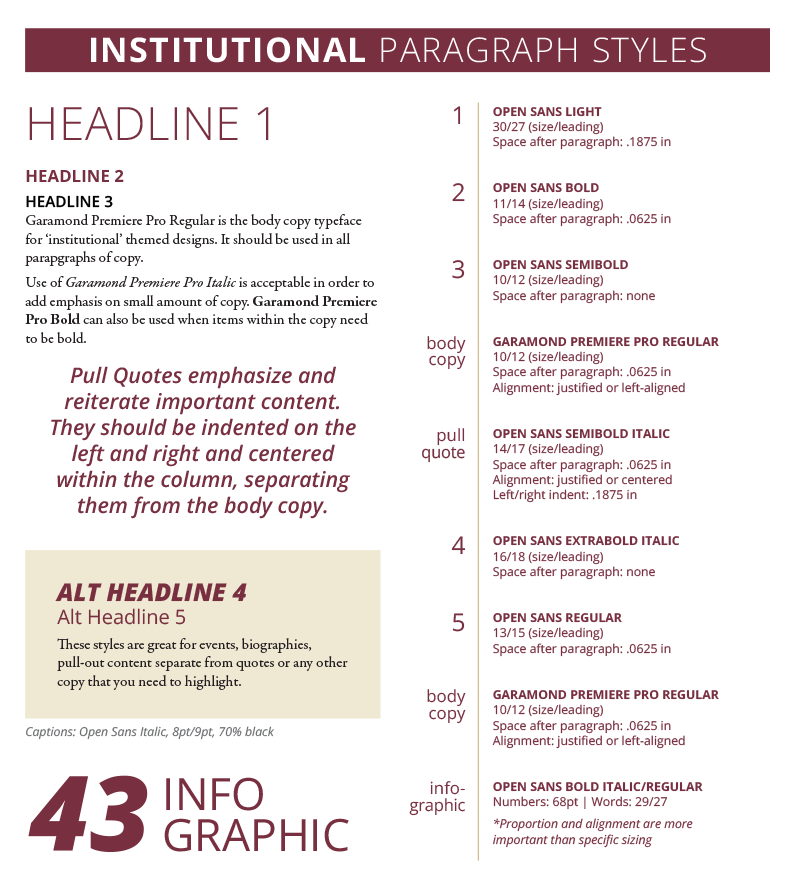
Paragraph Styles
Three typographic themes have been developed for headings and paragraph styles: Institutional, Bold and Creative. They use different combinations and sizes of our brand fonts to create hierarchy in designs. These styles are especially helpful for creating a cohesive look in long-form designs such as annual reports or magazines. Additionally, this type of hierarchy is helpful for conveying meaning in all design.
As a rule, body copy should never be centered. We recommend left-justification or left-alignment. If you need help with paragraph justification settings, see this article: My Secret to Setting a Balanced Block of Copy.
Photography
Photography helps us enhance storytelling and connect with people in ways that words cannot. An entire story can be told through photographs when the right images are used. Our images should tell the FSU story, convey the spirit of the university and inspire a connection with FSU.
Our photography should convey the following things:
- Authenticity: Photos should be natural and evoke emotion. Feature the FSU spirit and the dynamic nature of our community.
- People-Focus: Highlight students, faculty and staff that embody the core values of FSU. Capture candid moments and genuine expressions to create compelling images that tell a story.
- World-Class Academics: Showcase scholarly excellence and notable research. Convey the significance of academic exploration, research endeavors and valuable contributions to the world.

Best Practices
- Involve real people. Involve the audience by creating an engaging visual experience that encourages viewers to feel connected. Avoid using stock photography.
- Photograph people in their environment. Convey a narrative by capturing an individual’s personality and revealing a glimpse into their lifestyle.
- Pay attention to detail.
- Incorporate FSU’s brand through apparel and colors.
- Remove distracting elements and other logos.
- Avoid clutter and distracting elements.
- Choose lighting wisely. Ensure the area is well-lit. Avoid distracting shadows or highlights.

Submitting photos
We encourage and welcome image submissions to our central digital asset manager from all departments and entities on campus. We have a beautiful, vibrant campus with over 40,000 students, and we want to showcase as much of FSU as we can.
Because photos convey messages both consciously and subconsciously, we must maintain a high standard of photography to represent the elite nature of our university. Because of this, all images submitted for the FSU Digital Asset Library are reviewed by marketing and must follow these guidelines:
Photos should have vibrant colors and good contrast.
Muted and/or off-color photos can have a negative emotional impact and do not showcase the beauty of our campus.


Muted Examples
Photos should always have a point of focus.
Images that are soft (or blurry) without a sharp point of focus may also have a negative emotional impact.


Soft Examples
Photos should have proper exposure.
Images that are over-exposed will have bright areas that can distract the viewer’s attention from the subject. Under-exposed images will be dark and may obscure details, as well as have a negative emotional impact.

Over Exposed Example
Under Exposed Example
Photos should be high resolution.
Low resolution images may appear blurry or pixelated when reproduced. Remember, resolution can easily be reduced for uses such as websites but cannot be increased without visual distortion.
Avoid cell phone photos.
Cell phone photos are typically of insufficient quality for most uses except social media and will not be accepted into the FSU Digital Asset Library.
Photography Tips
Don’t be afraid to try different angles of view or use wide or zoom lenses. These can add valuable visual impact.
Leaving negative space in a photo is a great way to allow a variety of uses. Often called “copy space,” it allows text to be overlayed on the image without covering the subject.